

Elements of Good Design
How can we use the elements of good design to improve our graphic designs?
Elements of Good Design
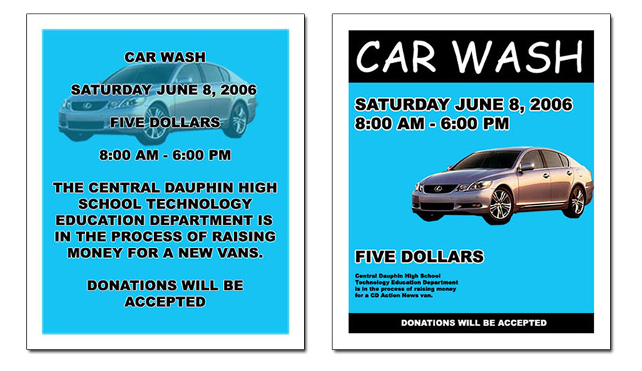
Examine and evaluate the advertising poster designs above.
- Which poster is the better design?
- Why is one poster better than the other?
- Which poster is the better design?
- Why is one poster better than the other?
Although the two designs contain the exact same text, colors, photos, and information, there is an obvious difference between the two.
The first design is missing the critical elements of good design: contrast, repetition, alignment, and proximity.
The second design utilizes almost all the elements of good design.
Applying contrast, repetition, alignment, and proximity in graphic design ensures that your designs look neat and professional.
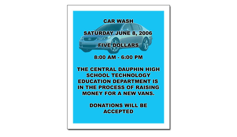
Design One
All text is the same size. No words or phrases stand out as the focal point.
The text is in all caps. This makes the design look crowded.
The text is aligned to the center. This is a common beginners' mistake.
- Avoid aligning all the text to the center.
- Try to align text to the left, right, or justified.
- Use extreme caution when using more than one alignment.
- All text should be aligned against one invisible line.
- Avoid aligning all the text to the center.
- Try to align text to the left, right, or justified.
- Use extreme caution when using more than one alignment.
- All text should be aligned against one invisible line.
The watermark in the background is too dark.
The text blends into the background.
There is not enough empty space.
Don't be afraid of empty space.
Related text should be grouped together.
Non related text should be separated with empty space.
The most important parts of the poster have no contrast.
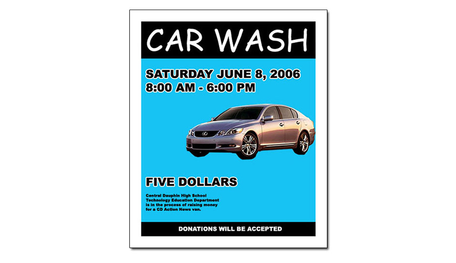
Design Two
The most important parts of the design are emphasized.
The size of the text varies depending on it importance.
The font type varies.
The text is clear and easy to read.
The text within the body is all aligned to the left.
The text within the body lines up on one invisible line.
The black on blue contrast makes "Car Wash" and "Donations will be accepted" stand out.
Similar text is grouped together.
Non similar text is separated by empty space.
The photo is clear and distortion free.
Correct Design
There is no one correct answer in design. There are hundreds of possible ways to create the car wash poster shown above. Even though there is no correct design, one design can be better than another design. The designer's goal is to use design principles to control the readers' eyes and to keep the attention of the reader for as long as possible.