

Business Card Design
How should information on a business card be organized to ensure its clear and easy to read?
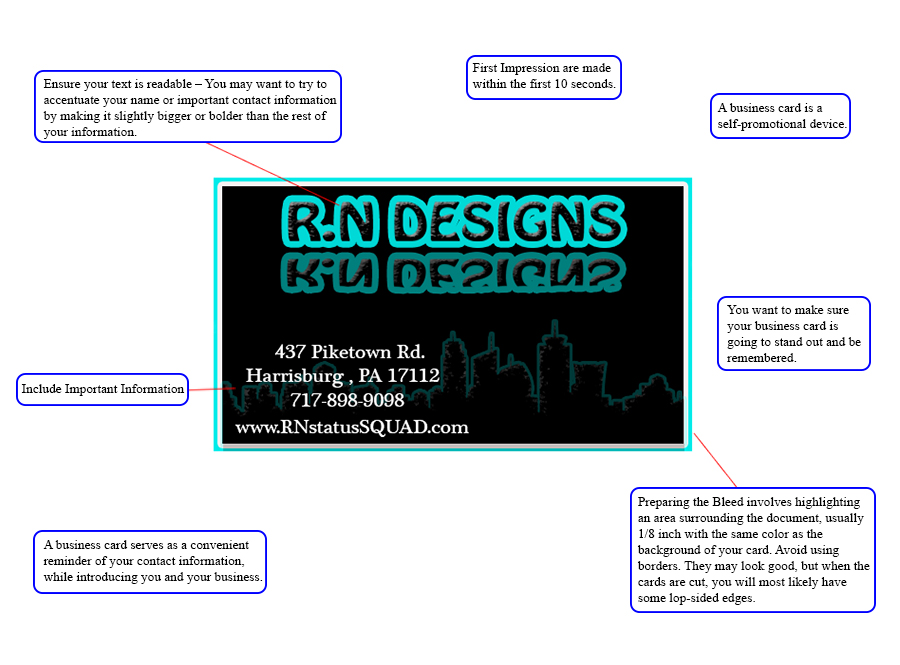
A business card is a small card printed with one's name, professional occupation, business address, and other contact or important information. Business cards are often used as a promotional tool or memory aid.

Not all text needs to be the same size. The title may be 12pt or larger and less important information may be 12pt or smaller.
Don’t be afraid of empty space.
Group similar information together.

Alignment is the position of elements on a page. Nothing should be placed on the page arbitrarily. Every element should have some visual connection with another element.

Text should be aligned to the left, to the right, or centered. Alignment to the left or right along an invisible line gives the design strength. Do not center all your text in all your designs. Center alignment is the most common alignment that beginners use. This alignment usually produces an amateur design, with little empty space.

Items relating to each other should be grouped close together. When several items are in close proximity to each other, they become one visual unit rather than several separate units.
Scattering items all over the page causes the page to appear unorganized and sloppy. Vary the space between elements indicate the closeness and the importance of the relationship.
Business Card Design Notes
Include standard business card design elements.
Create or select visual elements in order to create effective communication.
Organize and arrange design elements so that they are functional, easily accessible, and create visual impact.
Make decisions about visuals, colors, fonts, spacing, and sizes.
Ensure everything is neat, clean, accurate, functional, and simple.